Apr 27, 2024 | Blog
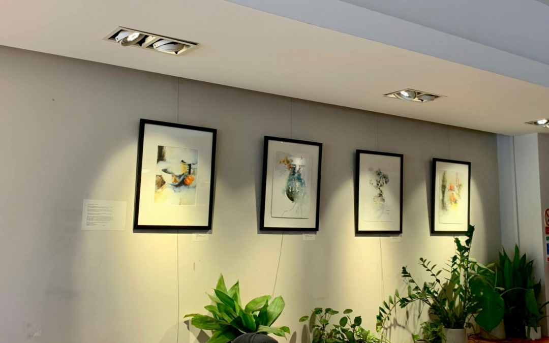
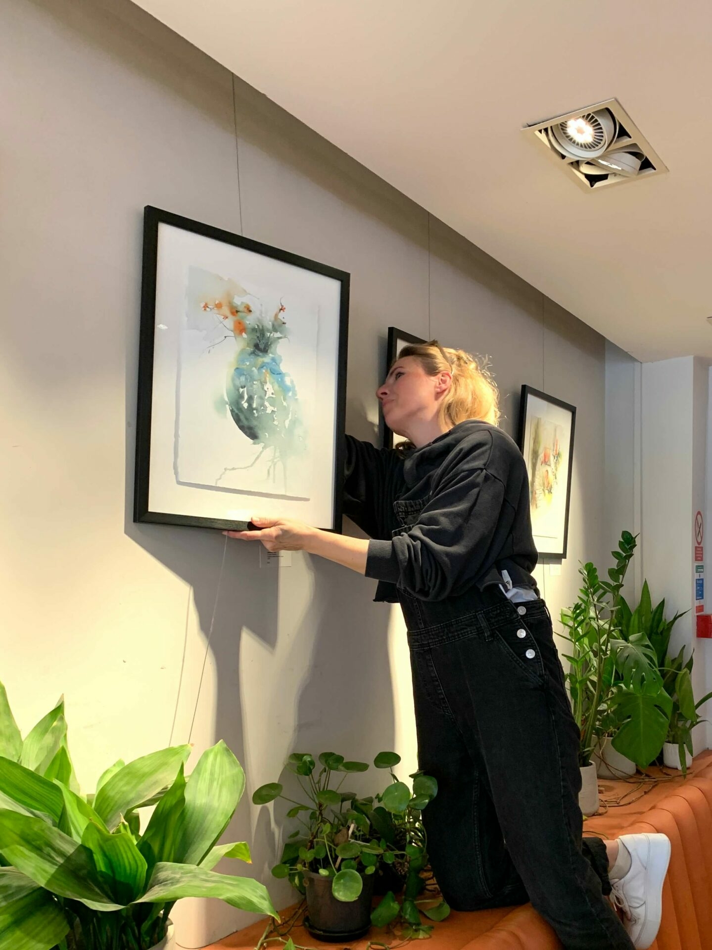
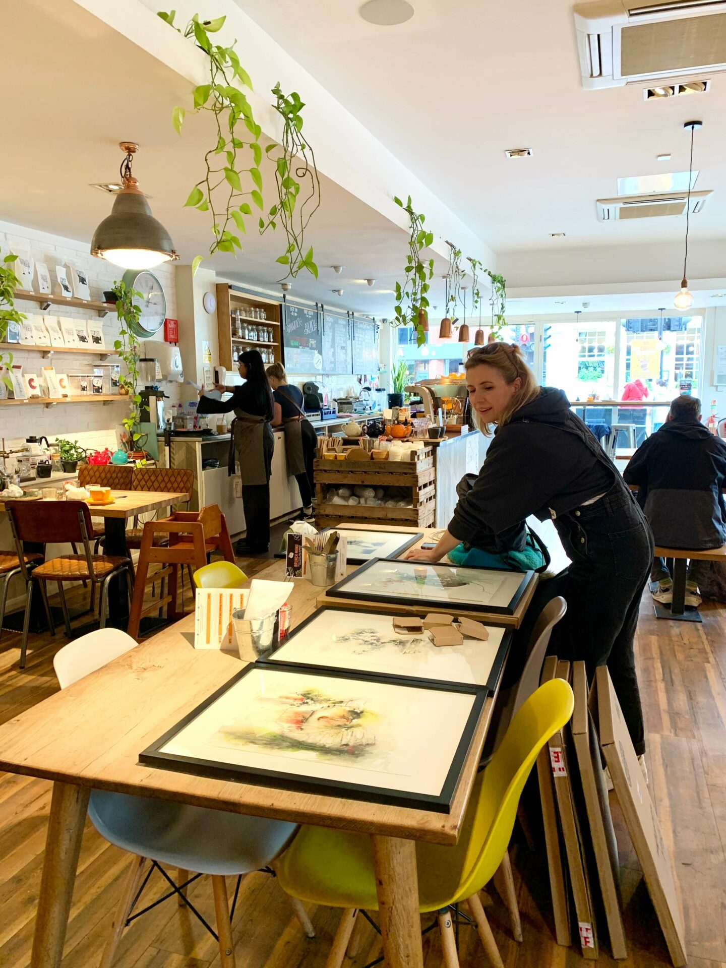
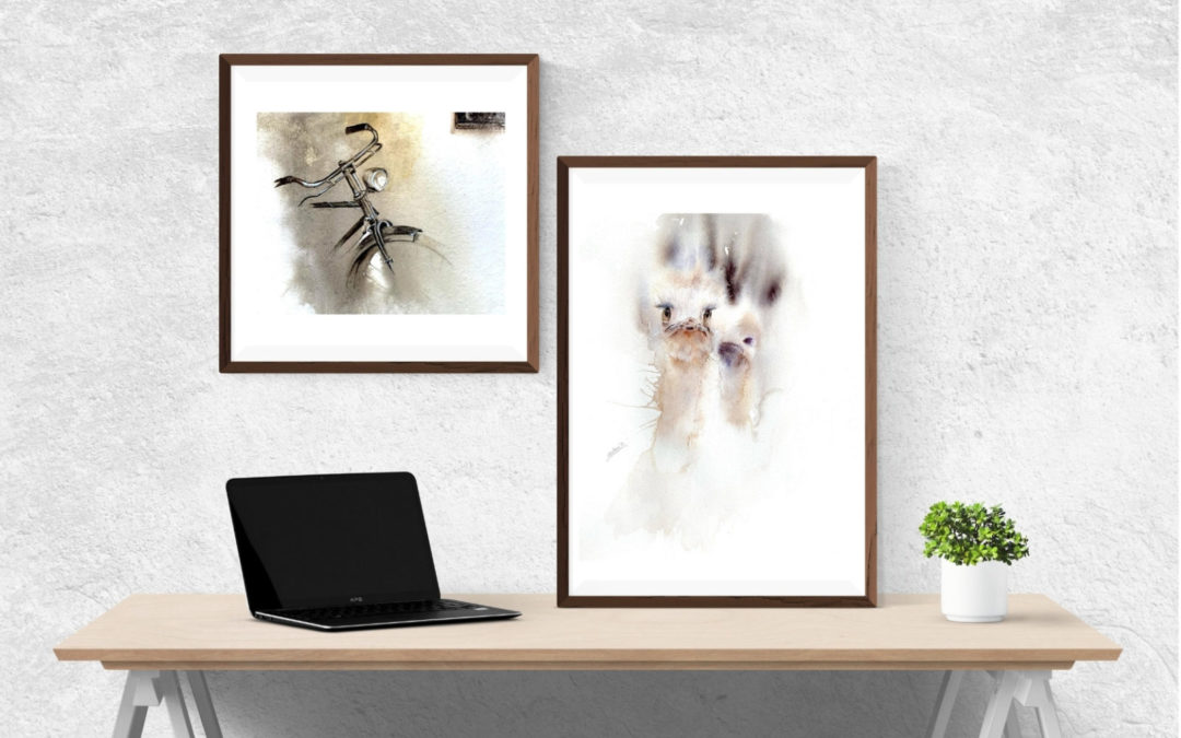
Six of my original paintings have a new temporary home in the Twickenham’s Press Room – a coffee house with jumbo sized pastries, great playlist and an excellent coffee. They’ll be hanging there for the next few weeks – over April – May 2024, nicely framed and for sale on the spot.
My thanks to the art-friendly management who encourage local artists to show their work in this buzzing spot.
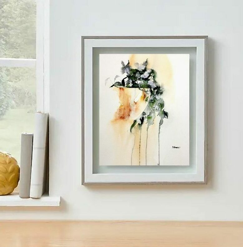
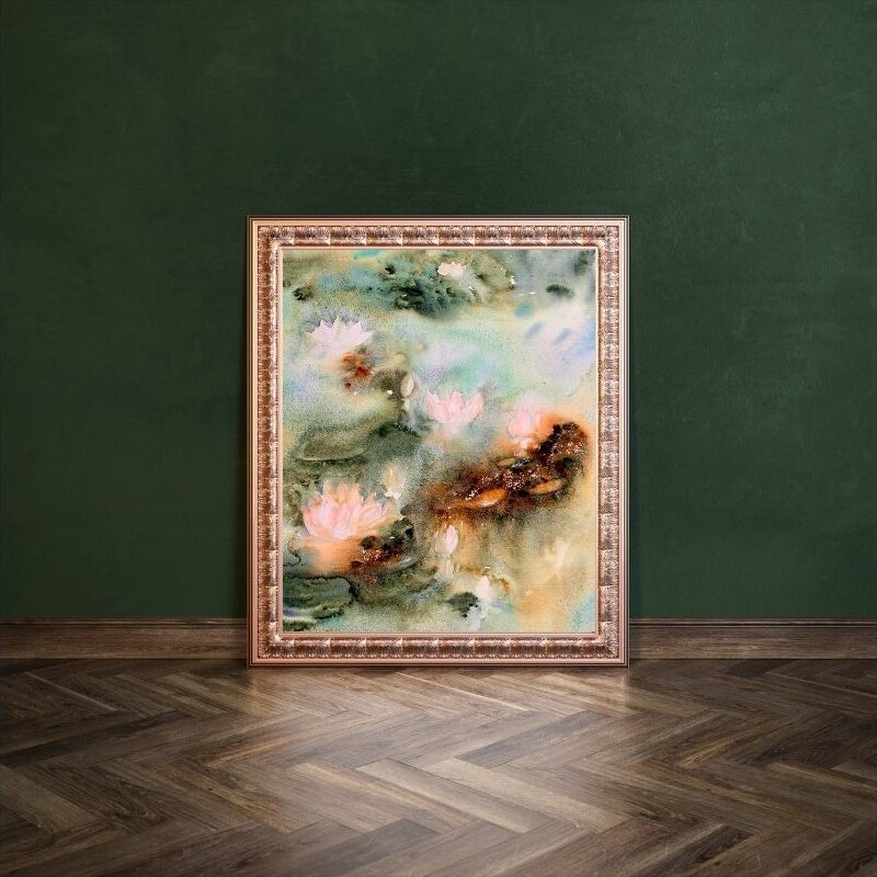
Bonsai – framed original painting
Passing By – figure painting – framed
Japanese Vase – framed original painting
May 6, 2023 | Blog
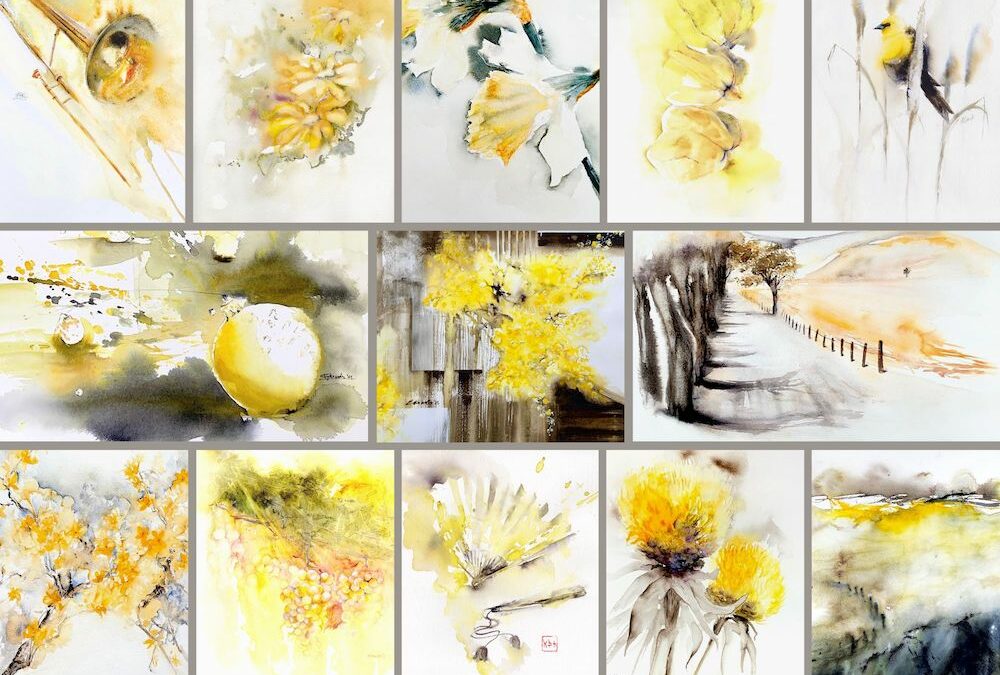
“In my world, yellow lives its best life in the company of neutrals”. Z. Edwards
Every colour has meaning that we either inherently sense or have learned about by association or conditioning. Yellow is the colour most often attached to the warmth and joyfulness of sun. It is the most visible colour on the spectrum and it captures our attention more than any other colour.
In the natural world, yellow is the colour of sunflowers and daffodils, egg yolks and lemons, canaries and bees. In our contemporary human-made world, yellow is the colour of Sponge Bob, the Tour de France winner’s jersey, emojis that reflect growing smorgasbord of emotions, post its, and signs that alert us to danger or caution.
In modern times, the colour yellow was used as a way to treat depression and boost moods as early as 1917. During World War I, a colour researcher Howard Kemp Prossor designed hospital rooms meant to calm the nerves of shell-shocked troops. No surprise then that the vibrant sunflower has become a symbol for depression-successfully treated.
Though there are countless positive associations, yellow has had a bumpy ride in history. If you’re tickled to know why yellow is the colour of controversy and what’s a Ketchup and Mustard Theory, pop over to 6 interesting facts about the colour yellow.
As for our perception of the spectrum – lighter pastel yellows are seen as childlike and immature while canary yellow is feathery and soft to the touch. Slightly greenish Dijons and curries lean more to the exotic side of the yellow family, while ambers and topaz are viewed as more ‘upscale’ and luxurious. The closer to orange it moves, the more garrulous and outgoing yellow becomes.
Apr 28, 2023 | Blog
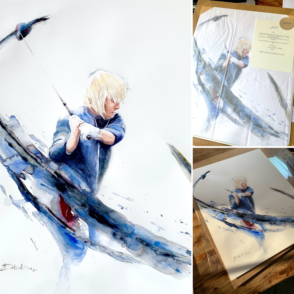
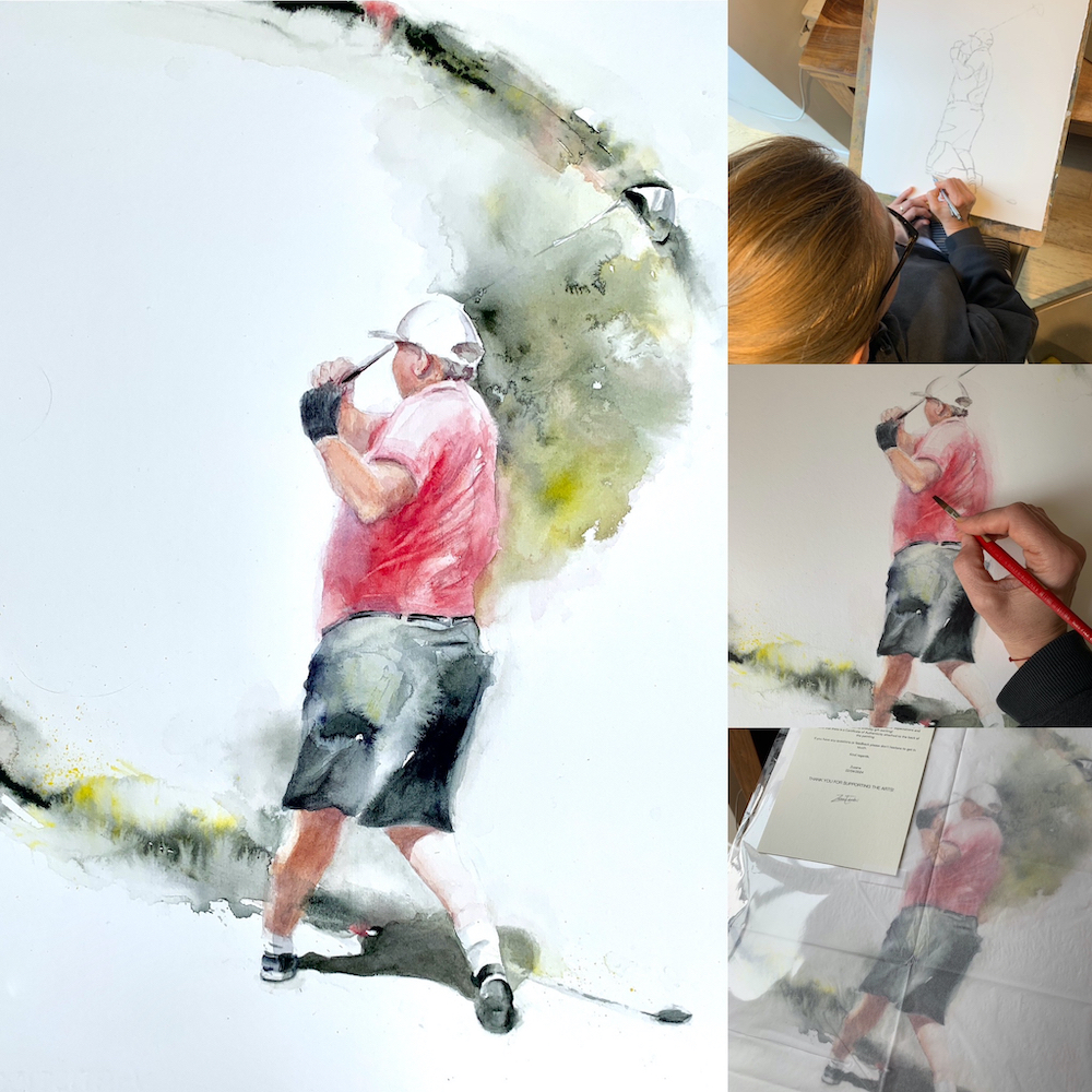
Why golfers?
My inspiration to paint golfers in action started with painting a birthday gift for a close friend, an excellent golfer. She loved her present and wasn’t shy about shouting about it from the rooftops (social media). From that point inquiries and commissions started coming in, gradually increasing in demand. Artistically speaking, I love the challenge of capturing a figure in movement and finding ways to convey the energy of a golf swing.
If you’re interested in having your own swing captured in a customised painting, the following will answer some of your questions.
Approach: In my golfer paintings, I focus on the energy and movement of the figure. I usually work from video footage of the golfer practising the swing…I study the movement and choose an interesting moment and composition. The footage should be of good quality, ideally from a sunny/bright day.
Style and Colour: What style appeals to you? Are there any particular paintings of mine you find compelling? I typically work with a fresh but limited colour palette or in monochrome. Do you have any particular colour you’d like to see? Warm or cold palette, subtle or saturated colours? It’s also okay if you don’t have any specific preferences, I can make suggestions.
Size: Movement pieces in watercolour work well on sizes 28 x 38 cm or larger. The examples shown below are 40 x 50 cm. What size and format suits you (portrait, landscape or square)?

‘Ali’, 40 x 50 cm
Client review
” I have recently commissioned Zuzana to create me a piece of art for me to gift to my husband for our anniversary.
She’s absolutely blown me away with what she’s created I am completely over the moon  .”
.”
– Ali –
Pricing: I’ll provide a quote based on the individual requirements. Considerable savings can be made when commissioning multiple paintings.
The price will include painting on paper, an archival backing board, clear sleeve and a secure packaging, ready for posting. Postage within the UK is included in the price. International postage depends on the destination. Typically, within Europe the postage is £30 and outside Europe ca £60.
Payment: Online transfer to my business account. 50 % is payable in advance and 50% upon completion. I’ll send over the photos of the finished piece for approval prior to posting.
‘Simmi’, 40 x 50 cm
Client review
‘I just received a fabulous commissioned painting of myself swinging a golf club.
It’s by far the best gift ever and is taking pride of place on my wall . Love it !’
– Simmi –
‘Zuzana was fantastic and nothing was too much trouble for her – everyone at the party commented on her workmanship
and how she had managed to capture Simmi’s golf swing.
Thank you so much !!’
– Lisa –
Timing: Allow 7-10 days for the painting and 3 days for delivery in the UK. The process can be expedited, should there be a need.
Framing: and/or mounting is available upon request at additional cost. I’m happy to suggest framing options that would suit the piece and places where to source them.
Authentication: The works come signed on the front and with a Certificate of Authenticity attached to the back.
‘Paul’, 40 x 50 cm
So much for the bones but as for the details each commission is individual to the personal preferences of a client.
If you have any questions, don’t hesitate to contact me via the website or drop me an email [email protected].
Nov 14, 2021 | Blog
With so many choices available selecting the right frame can be a bit of a pain. Here are some simple tips and visual references for works on paper.
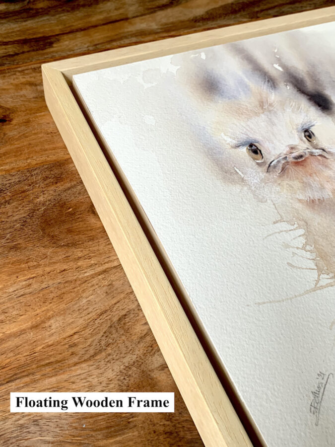
Floating, Matting or Bleeding to the edge
Floating means the artwork is attached to a backing material like an acid-free core (a thick foamy card) or a wood panel, allowing for a gap between the work and the frame. This type of mounting creates a shadow around the work and adds another dimension. It’s suitable for original paintings on paper with an interesting texture or edges.
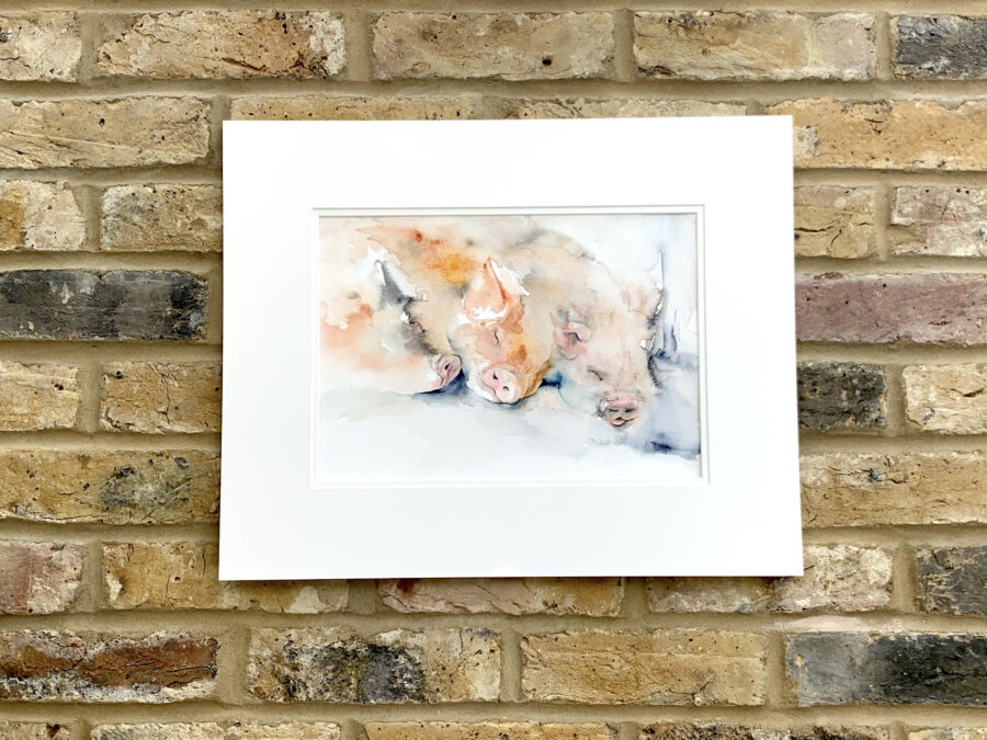
Matting is a common way of presenting art. A white or an off-white mat is a safe choice and often the most effective in letting the art stand out. If you’re tempted by coloured mat then don’t go for lighter than the lightest or darker than the darkest colour/tone in the painting. One mount is clean and classic, but if you do go for second – accent mat choose a colour from the painting. Matting works well with small and medium sized artworks. Large mats on a small detailed artworks can look particularly attractive.
Bleeding to the edge is what it says on the tin and is as straight forward as it gets. It’s suitable for larger artwork or prints and for pieces with white border or plenty of white space around the subject.
For further framing consultation get in touch [email protected].

Oct 12, 2020 | Blog
What to look out for before you buy.
You found a piece of art you love – and there is no better reason to own one than love. It moves you, it lifts your soul and your happy hormones are having a party, just looking at it.
Now for the matter of mind. It’s not always clear what type of artwork is presented – is it original painting, print or is it a poster?
Here are some of the most common types of 2D artwork sold and terminology that goes with it.
Originals
Original painting – refers to one of a kind, unique piece of art – painting created, signed and certified by the artist. They hold most value (financial and emotional) and in some cases appreciate with time.
Original copy in an edition – refers to multiple copies of a painting, produced – painted (not printed) by the same artist. Essentially, it’s the same image painted multiple times. These are still originals, but the artist needs to declare the item number and how many copies are there are in an edition. It’s usually displayed as a fraction 5/25 on the painting. Anything that isn’t numbered should be a one of a kind original piece of artwork. If there are multiple copies that exist of a particular painting and they aren’t identified with an edition number, it is classified as wall art and not considered original.
Prints
There are two types of prints what is referred to as original hand pulled prints and limited edition artist approved prints.
We’ll cover here the latter – limited edition prints. They are created from original works of art – paintings. These are also signed and numbered by the original artist giving permission for these prints to be made. In this category you have limited edition prints and canvas prints.
If artworks are copied and not signed or numbered then it is considered a poster, wall art, or décor art and not original. It can also be assumed to have been copied without permission of the artist is therefore an open edition copy and has no value. Open editions are the same as posters; they are reproductions or copies only without any value. Any prints outside an edition are also posters or décor art.
Fine art versus digital prints
Simply put, it boils down to longevity.
Fine art, also known as giclee prints refer to printing process using inkjet printers on archival, high quality paper. Giclee prints are far superior to all other forms of printing. When done correctly, it’s the closest an artist can get to matching their original 2-D artwork. Perhaps even more importantly, fine art prints (unlike digital prints) will last. If kept out of the sunlight they remain true for decades, not weeks as the case would be with digital prints.
I hope this offers a bit of clarity before make your next art purchase.
